a Wave Sunrise

A Wave sunrise quilt asks for movement. If the lines are too stiff, the scene can feel flat. If the colors are too random, the glow disappears. For this wave sunrise quilt, I wanted the whole piece to feel like morning light rolling across water or hills, with soft rose, pink, and orange fabrics doing most of the work before the applique sun took its place.

The finished quilt measures 80 x 120 cm, about 31 1/2 x 47 inches, which is a good size for a wall hanging. It is large enough to make a strong visual statement, but still manageable on a domestic sewing machine with careful planning.
The starting point was simple: I wanted to make a sunrise scene without sewing a literal picture. No hard horizon line. No perfect sky stripes. No detailed water reflections. Instead, I wanted curved bands of color to suggest waves, light, and landscape all at once.
I worked using supplies I already had, which made the color decisions more limited. Choosing from stash fabrics can feel limiting at first, but it often gives a quilt more character. Slight differences in tone, print scale, and texture keep the finished piece from looking too controlled.
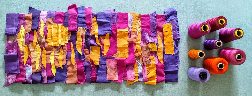
Before cutting anything, I spread my fabrics out and grouped them by temperature and value. With a limited color family like rose, pink, and orange, value matters as much as hue. A pale blush and a deep coral may both read as pink, but they do very different jobs in a composition.

The wave landscape patchwork technique
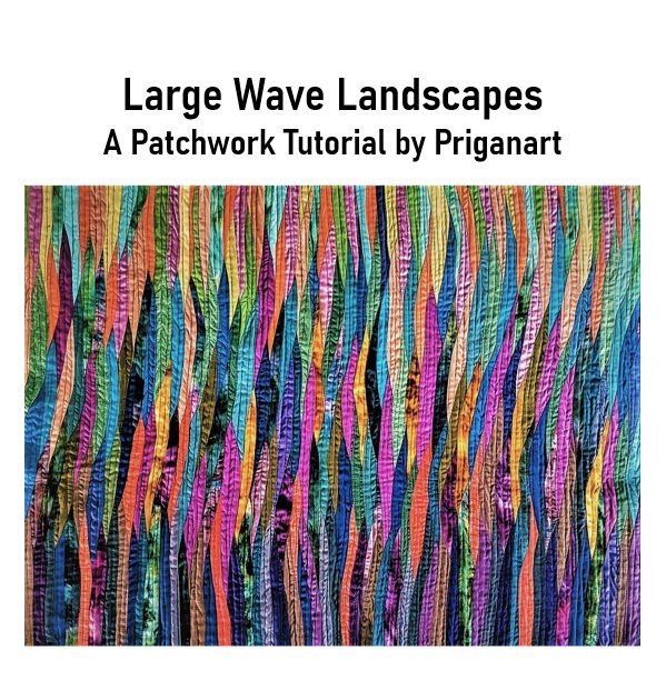
The wave landscape patchwork technique I used is based on curved bands built from strips. The goal is not perfect symmetry. The goal is flow.
The seams create visual movement, and the color placement creates light.
Curved piecing can intimidate quilters, especially without pins.
I used a standard seam allowance and sewed slowly, keeping the edges aligned just ahead of the presser foot.
A few helpful habits made the seams cleaner:
Stop with the needle down when adjusting the curve
Lift the presser foot slightly to release tension
Smooth the fabric with your hands
Press the seam gently instead of ironing back and forth
After sewing each curve, I checked the piece on a flat surface. If a seam had a small pucker, I fixed it right away. Small issues become harder to correct after more strips are added.
The wave technique works best when the color movement feels intentional.
The trick is to repeat colors enough so that they feel connected. If one bright orange scrap appears only once, it may look accidental. If that same orange appears in two or three places, it becomes part of the design.
With a large curved patchwork piece, it is easy for edges to become uneven. Instead of waiting until the whole top was complete, I trimmed and checked sections during construction.
I kept the overall 80 x 120 cm size in mind, but I left extra fabric around the edges. This gave me room to square the quilt after quilting.
For a piece this size, extra margin is helpful. I would rather trim away a little at the end than discover that one corner has shrunk inward.
An 80 x 120 cm quilt is not huge by bed-quilt standards, but it is large enough to require planning. The surface has weight. The curves can stretch. The applique pieces need to stay smooth. The quilting has to support the whole design.
Use a design wall or temporary layout space
A design wall makes a major difference. If you do not have one, a flannel-backed tablecloth, a batting scrap pinned to a wall, or a clean floor can work.
Seeing the quilt vertically helped me judge the sunrise effect. When the piece was flat on the table, I tended to focus on individual fabrics. When it was on the wall, I could see the whole composition.
I checked for:
Color balance
Wave direction
Areas that felt too busy
Sections that looked too empty
Whether the sun placement still made sense
I took quick phone photos during the process. Photos make contrast easier to see. They also reveal awkward shapes that the eye may overlook in person.

Keep checking the measurements
Because the finished size was 80 x 120 cm, I kept a measuring tape nearby and checked the developing top often. I measured both width and length in several places.
Curved seams can cause one side to grow more than another. Measuring early helps catch this before the quilt becomes difficult to adjust.
Press with care
Pressing can make or break a curved quilt top.
I pressed seams with the iron lifting and setting down, rather than sliding across the fabric. Sliding can stretch curved or bias edges. Steam can help flatten seams, but too much steam can also distort the quilt. I used it lightly.

Even with careful measuring, a curved patchwork quilt can shift slightly. I built the top a little larger than needed so I could trim it cleanly after quilting.
For a finished 80 x 120 cm piece, I planned enough extra around all sides to allow for squaring. The extra edge space also reduced stress. I did not need every seam to land perfectly at the raw edge because I knew the final trim would clean things up.
Adding the sun with applique
Once the wave background was complete, it was time to add the sun. This changed the quilt from an abstract warm landscape into a sunrise.
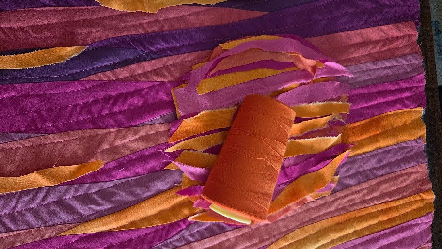
I chose applique because it allowed the sun to sit cleanly on top of the patchwork. Piecing a perfect circle into curved waves would have been much more complicated, and it might have interrupted the flow of the background.
Choosing the sun fabric
For the sun, I chose the warmest orange and golden and pink fabrics from the supply stack. I wanted the sun to stand apart without looking harsh.
Before cutting, I auditioned several options by placing them on the quilt top. The best choice was not the brightest fabric in the pile. It was the one that looked warm against both the pink and rose waves.
Placing the sun
Placement took more time than cutting. I moved the sun around the top several times before stitching it down.
Before stitching, I pinned the sun and viewed the quilt from across the room. I also took another photo. Once applique is stitched down, moving it becomes a much bigger job, so this pause is worth it.
Adding sun rays with applique
The sun rays were the part that tied the whole composition together. They reached across the waves and helped blend the applique with the pieced background.
I made the rays as tapered shapes rather than straight strips. This kept them from looking stiff. The rays followed the movement of the waves.
The ray fabrics came from the same orange supply stack, but I chose brighter pieces than I used in the lower waves.
A few rays matched the sun closely.

Curved seams stretched more than expected
Some of the longer curves had bias edges, which can stretch easily. A little stretch adds movement, but too much creates ripples.
I managed this by handling the sections gently, pressing carefully, and stabilizing the top through quilting. On a future version, I might use even larger curve pieces in a few areas to reduce the number of seams.
The sun placement took patience
I pinned it in several positions and left it on the design wall for a while before deciding. That pause kept me from making a quick choice I might regret later.
The rays needed restraint
The rays were tempting. Once I started cutting them, I wanted to add more and more. But the patchwork already had movement, and too many rays covered the waves. Editing was the right choice. The final rays give enough direction without taking over the surface.
What I love about the final outcome
The wave landscape patchwork gives the quilt its movement. The applique sun gives it focus. The rays create connection between the two.
My favorite part is that the quilt does not rely on perfect realism. It suggests a sunrise without spelling out every detail. That leaves room for the viewer to bring their own feeling to it.

It also reminded me that using what you have can lead to strong design decisions. I did not need a perfect fabric collection. I needed a clear color direction, patience, and a willingness to adjust as the quilt grew.
Encouragement for making a wave sunrise quilt
If you want to try a similar quilt, start with a limited color palette and let the curves do the storytelling. Rose, pink, and orange are a beautiful combination, but the same method could work with blues and greens, golds and creams, or purples and peaches.
A few final tips will make the process smoother:
Choose a finished size before you begin, even if you work improvisationally.
Choose more fabrics than you think you need, then edit the selection.
Use long, gentle curves if you are new to curved piecing.
Step back often to check value and movement.
Add applique only after the background is done.
Keep the sun and rays in scale with the quilt.
Leave extra around the edges for trimming.
Most of all, do not let curved patchwork scare you away. It does not need to be perfect to be beautiful. In a wave-inspired quilt, slight variations can add life. A curve that dips unexpectedly may become the best part of the composition.
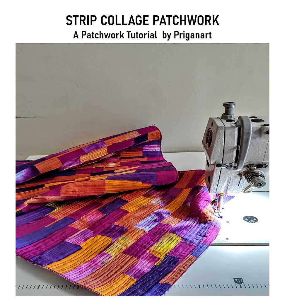
The 2 techniques that I used


Comments